

Pocketpal
Nurturing Financial Independence in Every Child.
UX Design
UI Design

Role
UX & UI Designer, with guidance from my mentor and tutor
Year
2024
Process
Research, surveys, interviews, competitive analysis, ideation, prototyping, testing, evaluation, iteration
Tools
Figma, Miro, Google Forms, Optimal Workshop, Lyssna

Overview
PocketPal is an educational family app offered to families to empower children aged 6-16 with essential personal finance skills. We provide the knowledge and tools needed for children to navigate financial concepts, including saving, spending, and earning, all under the supervision of their parents.

Under the CareerFoundry UX Design program, I created an app using the Design Thinking Process as a general framework. This approach guided the product's journey from conception to implementation, while embracing its non-linear nature and allowing for iteration at every stage.
1
Empathize
2
Define
3
Ideate
4
Prototype
5
Test
Unfolding the problem space

Problem Statement
Parents of young children need a way to introduce financial concepts in a playful manner because traditional banking methods may not capture the interest of children since they often find money abstract and challenging to understand.
Project goals

Desk study
👨👩👧
Parental Focus on Financial Education
Traditional schools struggle to address financial literacy
By age 7, most children develop basic money habits
Early financial literacy correlates with better financial habits in adulthood.
📱
Digitization in Financial Services
Over 60% of consumers prefer digital financial management
Digital banking expected to grow at an 11.5% CAGR
COVID-19 accelerated the shift toward digital payment adoption
🧒
Relevance for Younger Generations
76% of teenagers prefer mobile payment apps over cash
Digital banking tools tailored to children are crucial for preparing them for a cashless future.
The U.S. and UK have several child-focused finance apps like GoHenry and Greenlight, but Europe's market remains relatively untapped. In Belgium, traditional banks like KBC, ING and BNP Paribas Fortis dominate the market, offering basic child accounts with limited interactive or educational features.
The company
Strenghts
How Are Our Competitors Shaping the Landscape?
Weaknesses

MyMonii is a privately held FinTech company based in Copenhagen, Denmark.
Demo account with simulated money
Simple and straightforward UI
One of the only pocket money apps that offer services to kids starting from 6 years old.
Restriction to connect only one mother and one father to the app
Single-person deposit restriction for the parent balance
Limitations on transferring only predefined amounts
Inability to withdraw deposited funds from parent balance

Gimi, a FinTech company has collaborated with ABN Amro to launch a financial literacy app based in Stockholm, Sweden.
Demo account with simulated money
App includes in-app advisor called Piggy
Use of scientific data from a top Swedish university
Use of innovative technology
Gamification that is engaging for kids
The distinct user interface does not appeal to everyone
Feedback on actions are limited
Saving for goals is unclear how to do

Revolut is a global neobank and fintech company with headquarters in London, UK.
Ease in transferring money to child’s account
Customizable card
Fast transfers for emergency
Easy to set up
Available for Apple and Google pay
High fees
The UI for swapping profiles is complicated
Parents need personal Revolut account
Surveys
After initiating the project, I outlined my research strategy and objectives, prioritizing the understanding of the target audience and their challenges.
I created an online survey and distributed it across various communities. Within a few days, I gathered responses from 10 parents with children aged 6-16.
At what age do you think it is appropriate to introduce financial concepts to your children?
How involved do you want to be in your children’s use of financial applications?
Key insights
How comfortable do you feel about your child’s usage of digital applications?
What types of learning activities do you think are most effective for teaching your child about finances? (Select all that apply)
First, there is a significant variation in opinions on the appropriate age to introduce financial concepts, with some parents favoring an early start at ages 6-7, while others suggest waiting until ages 14-15. This reflects a diverse range of beliefs likely influenced by cultural and educational backgrounds. Additionally, parents generally want to be actively involved in their children's use of financial applications, with most preferring moderate to high levels of involvement.
Interviews
After completing the surveys I wanted to delve deeper into the research and gather qualitative data from my target users. I interviewed 7 participants with children aged 6-16.

User personas
Based on the surveys and interviews I conducted, I developed two personas to represent distinct user segments. I continuously refined them as I gathered more data throughout the project. These personas helped me step out of my own perspective and reassess my initial ideas whenever needed.
Persona 1
Persona 2
User Journey Map
After creating my personas, I mapped out a user journey to identify potential problems.
Lauren Macy
Scenario
Since Lola tends to spend impulsively, Lauren wants to use the app to help her set savings goals. She plans to create a goal around something Lola has been wanting for a while.
Goals
Be involved with setting goals together with her child
Keep Lola motivated to save up for her goals
Keep track of her savings goals and her progress

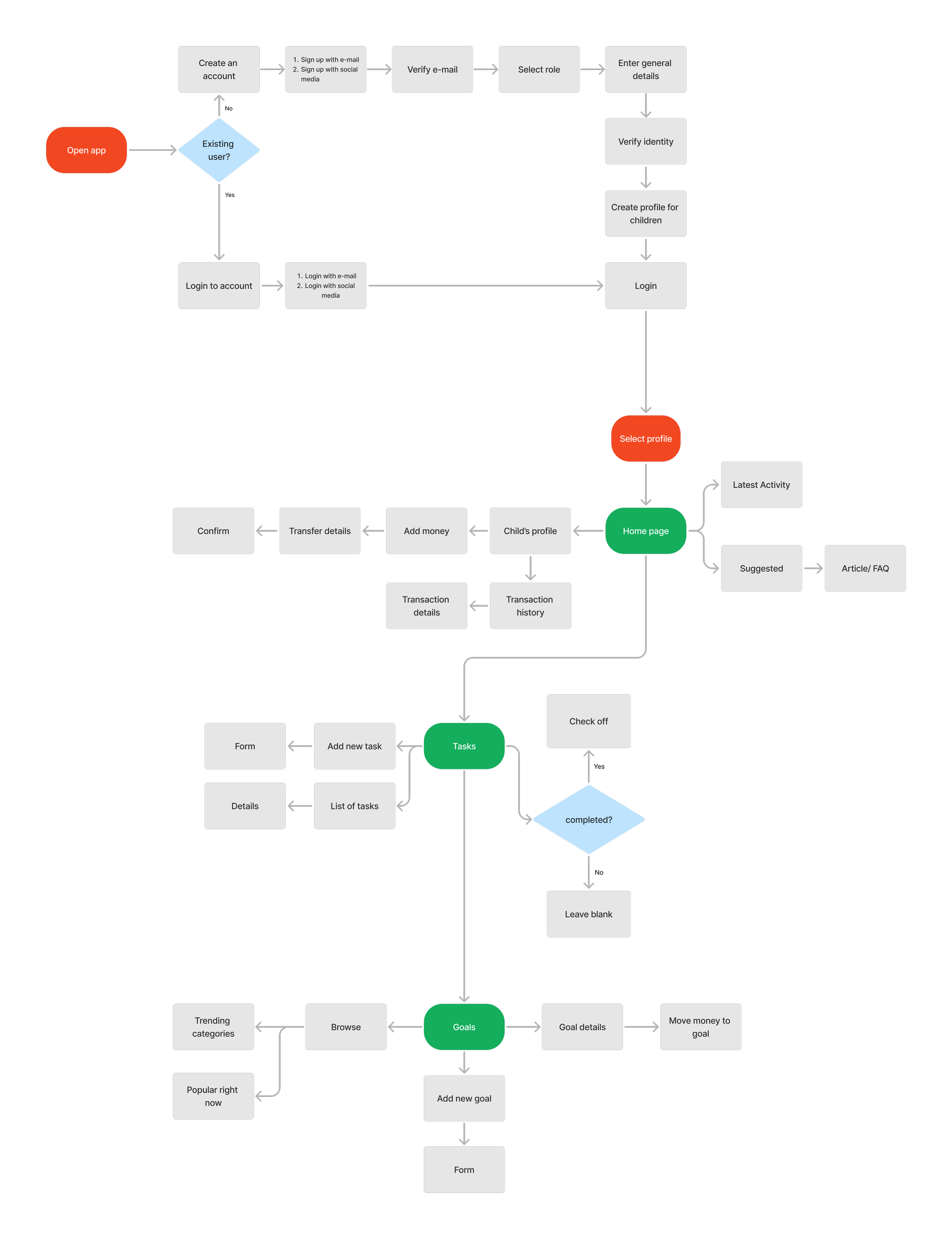
User flows
After having defined the features of the app, I created flows for the main tasks.
Sketches
To kick off the design process, I began with hand-drawn sketches to quickly explore different layout ideas and features. Sketching allowed me to iterate rapidly and visualize potential solutions before moving into more detailed wireframes. These rough drafts helped me identify the most effective design approaches early on, providing a foundation for further development.

Lo-fi wireframes
After finalizing key concepts through sketches, I moved on to creating low-fidelity wireframes in Figma. These wireframes focused on basic layout, structure, and user flow without getting caught up in visual details.
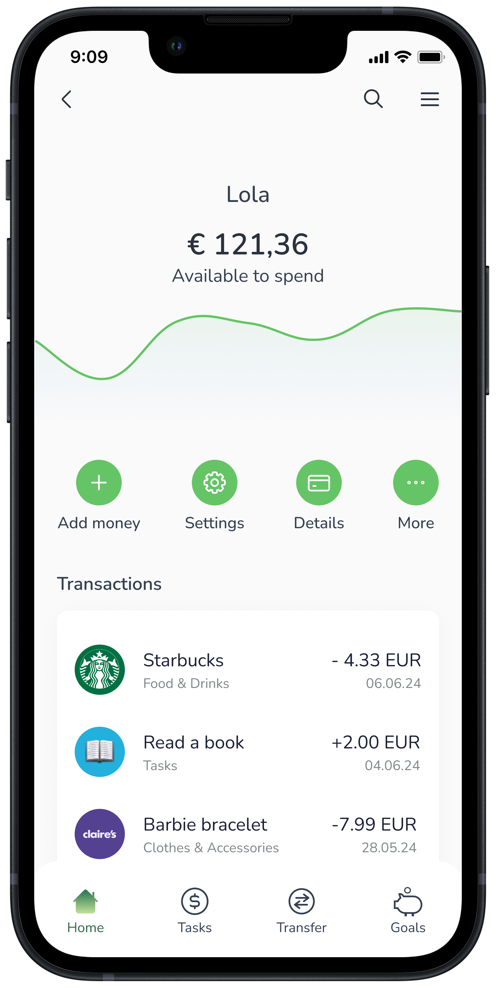
Dashboard


Spending wallet

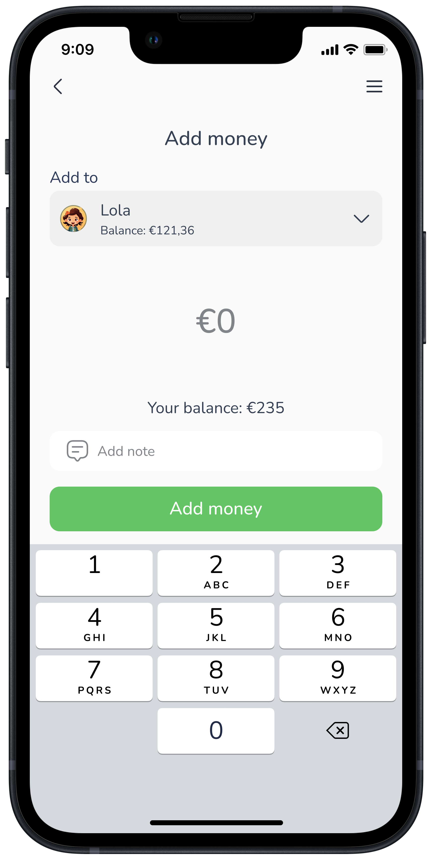
Top up wallet

Confirmation

Style Guide
The style guide embodies PocketPal's brand values and design principles. Its design elements focus on being light, friendly, and approachable. Much like a helpful companion guiding children and parents through their financial journey.
The icons that I’ve used are from Kalai Icons, an open source library.

PocketPal Moderated Usability Test
After having translated the low-fidelity wireframes into a high-fidelity functioning prototype, I tested it out with 6 users creating a test script and assigning them each 3 tasks to complete.
Test objectives
Evaluating the ease and learnability for users to deposit money onto the child’s card
Measure the time it takes for my users to find the savings goals
Discover whether users can locate the parent’s profile to find their remaining balance
Usability issues
Issue 01
Cards on the home screen weren't recognized as clickable elements, leading to unnecessary clicks and delays in completing the tasks.

“I’d expect to find the goals under the child’s profile since they created it”
Issue 02
No clear distinction between the transfer feature and the depositing feature.

“I was thinking I was managing the parent’s wallet”
Issue 03
The savings goals should be more intuitive and easier to locate, given its significance.

“The cards on the home page don’t look clickable”
Issue 04
The parent's remaining balance should be placed in a location that aligns with user expectations.

“Why is my balance not under Accounts”
Pivoting the designs
After conducting usability tests, I refined the designs through an iteration cycle, addressing the key issues I identified.
Before
Before
After

After


Takeaways
Summary
Money is often perceived as an abstract concept, typically left for adults to manage. As a result, schools and traditional banks often overlook the needs of younger individuals. I designed a family banking app that empowers children to learn essential money management skills through practical and engaging tools.
Challenges
Lack of imageries - small variety of illustrations in a consistent style
“Learn as I go” - my first UX/UI project, where I was still exploring and understanding the field.
Started with an open source design system but they lacked many essential elements so ended up creating my own.
What I learned
Prioritizing users and their perspectives over personal assumptions
Actively seek user feedback to validate and refine design decisions
Enhanced skills in creating interactive prototypes resembling final products
Maintain consistency using a design system
The next steps
The next steps involve conducting usability testing on the updated design, prototyping the transfer feature, and redesigning the app with a child-focused perspective. Plans include gamified elements like a point-based rewards system and interactive lessons to make financial literacy engaging and fun.

Thanks for reading!✨
Hope you enjoyed the journey as much as I did creating it! I’m always eager to learn, grow, and hear new perspectives, so feel free to reach out if you’d like to connect or discuss this project further!